QS rebrand
QS, from its origins is an entrepreneurial company that has grown organically to become the leading provider of higher education solutions and services in the world. The speed of the growth led to a fragmented brand identity which had left QS struggling to capitalise on its current and potential client base.

Who are QS?
QS is both a B2C (students) and a B2B (institutions) enterprise. For students, QS serves as a guide to help students along every step of their higher educational journey. It does this through rankings, ratings, scholarships, advice, nurturing and student focused events.
On the institutional side, QS has grown to become the established world leader in higher education performance and insights. QS’s insights and expertise enable universities to take a data-driven approach, to underpin their strategic thinking.
What we did
The main theme of the project as you will see was simplification. Just like any rebrand, the company in question had changed. What it had become was no longer the same as when it was formed, not only what it was had changed but also where it wanted to be had also shifted.
To understand what had changed we utilised data gathered by The House agency to understand QS's personality and culture, and the issues affecting the business. These insights informed our approach from the creative perspective to solve the brand architecture, and QS's visual story, as well as the staples of visual brand identity such as colour, typography, photography, illustration, and iconography.
QS is an extremely complex company, in order to simplify what we were asking from both QS’s internal teams and what QS’s external audience needed to remember we split the rebrand into two phases.
The first phase primarily centred around our student audience (B2C), with the mindset that if you can bring the students in the institutions will follow. The second phase centred around providing additional flexibility for QS’s more serious institutional (B2B) audience.
Whilst the major issues of our B2B brand were solved in phase one, the refined visual identity of the QS B2B communications is collated here.
Theory
Using Kapferer’s Prism as a tool to demonstrate the task we had of communicating the internalised aspects of the brand, the “Personality”, the “Culture” and the “Self-image” to QS’s external audience through the look and feel (the “Physique”) the “Relationships” and the direction and type of QS campaigns (the “Reflection”).
As Head of Creative my main focus was on the “Physique” and the “Reflection” elements of the prism. The “Relationship” section is more focused on interactions with staff, the tone of voice and the general way that the company interacts both internally and externally*.

Personality to Physique
The House agency gathered data both internally and externally about QS through surveys with clients, staff and students. This data enabled the consensus upon a new set of company values.
-
Ambitious
-
Passionate
-
Innovative
-
Helpful
-
Authentic
These values make up the personality of the brand and they can be found on the top right of the prism.
The next step was to build an agreement on what these ambiguous terms mean for the “Physique” of the brand. To do that I arranged a workshop to create a set of “Design Principles”. This would also ensure that consistent design decisions will always be taken.
The workshop consisted of content writers, social media specialists, graphic designers, illustrators, UX designers as well as senior management.
The workshop helped to clarify the ambiguous values into more design focused terms. Using both anecdotal and evidenced data we built word associations that we all considered important to QS and then through an affinity session linked them to each QS value.
These words enabled us to form our principles in increasingly concrete terms, but also helped us to understand what wasn’t important. Below is an example of how a design principle converts a company value to something tangible.

The final outcome of the principles were:
-
Bold - Our visuals reflect our passion for education
-
All in - We always aim for outstanding
-
Simple - We value our audiences’ time. If we can make it easier for them we should stop at nothing to achieve that
-
Inclusive - We believe that inclusivity and diversity helps to increase the quality and creativity of our output
-
Uniform - We seek to build strong design patterns to build trust. With calculation we can then break these patterns for maximum impact
Self-image to reflection
Working with our research team we were able to get a good understanding of our student personas. For the most part, the “Self Image” of our student audience already aligned quite closely with the company’s. This is not a surprise, QS has many employees direct from their studies at international universities and a very close relationship with our audience.
With this clear understanding alongside constant contact with our marketers we were able to develop themes that would resonate with our student audience. these themes form the concepts of all of QS’s campaigns.
Brand architecture problem

The company has been built through an entrepreneurial environment which has operated like a collection of companies within a company.
A side-effect of this organic growth can be seen in the snapshot (pictured) where each “company” desired its own indvidual identity.
Generally, these products did follow a monolithic structure ensuring the QS logo was always included in the primary position. However, many of these products would be referred to by their product name only (omitting the “QS”) this occured both internally and externally.
This has meant that the brand was asking the customer to remember each of their products individually. If the customer couldn’t remember or even know the product then they would consider that QS didn’t offer that service. Ultimately, this led to QS not optimising its client base.
Brand architecture solution

With the rebrand we focused on simplifying the ask that we put on our audience. Instead of remembering each product we only really wanted them to remember “QS”. This way we could build on the associations rather than investing heavily on trying to get our audience to remember each and every product and each of their individual associations.
Now the assumption will be “QS does that” instead of “I can’t see the product so they do not do that”.
For the brand architecture itself, the obvious solution was to follow a monolithic approach and completely minimise what should and shouldn’t have a logo. This approach reduces the ask to remember just two letters from hundreds.
To do this we assessed what products were already established for our client base and we looked to maintain their top-level identity with the individual logo, every product that wasn't well-established would then be housed under the QS umbrella and benefit from the centralised brand building that, that entails. Therefore, a separate logo / product brand identity was not required in those instances.
For what logos remained, we put in place strict guidelines to ensure that the QS was always at the top of the visual hierarchy.
Typography problem

I am showing a snapshot of some of the typography utilised throughout the 30 years of QS.
What will become commonplace throughout this case study is the side effects of the entrepreneurial roots of the company. Much like the brand architecture, the typography used was broad and varied.
A factor causing this was the lack of governance in the QS brand identity, decisions on advertising campaigns, diverging opinions on what the company identity was, as well as a focus on quick wins within teams meant that many choices were subjective, de-centralised and more often than not followed popular trends.
Various teams had attempted to instil a unified font choice, but these always lacked a broad consensus and tended to focus on one aspect (e.g rounded fonts are friendly) rather than looking more holistically at the brand impression.
Typography solution

QS acts as a guide to both its student and institutional audiences. Guides simplify complex information, they clarify.
To provide a sense of directness and straight talking, which we understood to be an integral part of being a guide we chose the Red Hat family of fonts. This would be selected as the primary typeface.
However, sometimes QS needs to speak with authority, a secondary font of Libre Baskerville for its gravitas and trust was also made available. This font pairs well with the Red Hat family due to its X-height and kerning.
The large array of fonts in use had presented a very diluted visual brand identity. I felt that initially focusing on as few variables as possible would help the brand become more memorable to our audiences within a shorter timeframe. This meant that we set about a two phased approach on releasing the primary and secondary fonts. For the first 18 months only the Red Hat Display family would be in use.
Colour problem

The orange is the primary brand colour of QS and one that the company want to become synonymous with. Yet, the palette pre-rebrand was detracting from that goal. The extensive variety of colours in place effectively acted as a camouflage to that key colour.
In fact, the inclusion of the colour orange in any communication was largely only within the logo itself. This ensured that the colour was on approximately only 2% of the real-estate of each communication.
This camouflage hindered the brand identity. There was no clearly recognisable cohesion throughout the QS brand (only within products), further embedding the separation between products within the audience’s minds and diluting the overall impression of the scale of the company.
Colour solution

My team and I built the new palette to accentuate the orange colour rather than detract from it. I wanted to use just three groups of colour. This would then guarantee a complete adaptation to the QS orange across the business.
This tight governance allowed us to build memorable design patterns that became so synonymous with QS to our audience that we could create strong impact with bursts of colour when we had a big announcement or key products to highlight.
QS are now able to use colour strategically and with impact.
Illustration problem

Pre-rebrand, Illustration had a heavy reliance on stock websites. The needs of the business for illustrative assets had increased, but the design team lacked the appropriate specialists within that field.
Instead, the team would adapt stock illustrations according to the QS colour palette. Alongside the issues stated previously with colour this approach further diluted the association with the QS Orange.
Even with the adjustments QS was not able to demonstrate authenticity within its imagery and illustrations, it could not stand out amongst its competitors and the broader attention economy that we now find ourselves in.
Illustration solution

Brands had began to utilise bespoke illustration for some years now procuring a lot of identikit illustration styles that were not differentiating the brand at all but rather following trends. QS had found themselves doing this with stock illustrations.
I knew that these illustrations had to be unique, they needed to be recognised as QS in their own right without the use of the QS logo.
To do that we ensured that the face of each character was identical, this also helped us generate a feeling of equality within our illustration style as well as simplifying the ask of our audience on what needs to be remembered.
The black-line style ensured that we could limit what colours could be used with the illustrations enabling the continued tight control of our colour palettes that was integral to our strategy.
The illustrations enabled us to present some clichéd concepts that if realised within a photograph would look dated and out of touch, whereas within an illustration they would feel new and authentic.
Photography problem

Photography to my mind is one of the hardest things to get right. It takes a great deal of abstract thought to drive emotion and go beyond simply illustrating a message.
Pre-rebrand at QS, photography could be selected by anyone, with no guidelines on image selection. This meant that the company image was only as strong as its weakest link.
PPC campaigns are the most effective tool for the student recruitment business model at QS. Understandably, whatever worked best here became the broader campaign. This ultimately lead to a visual approach reliant on trends and reactivity. Putting the company in a spiral where no brand building could be built.
These issues set an environment that the photography on the whole felt contrived and out of touch.
Photography solution

With authenticity being at the heart of the new QS values and QS' heavy reliance on stock photography meant we had a difficult problem to solve.
I put in place guidelines about photography (here) that articulate the importance of photography, our brand image as well as workflows to encourage more abstract thinking around photography selection to ensure our appearance was not inauthentic. Alongside the guidelines I also identified two stock sites that offered imagery that was, on the whole more aligned to our brand image in Unsplash.com and Pexels.com.
At the initial launch of the rebrand I limited the use of photography for our student audience to just 20% usage. This was primarily to embed our illustration style within our visual brand identity, but it also served as a way to reset the brand so that at a later date we could reintroduce photography in a more considered and effective manner, with teams appropriately trained to select on-brand photography.
Identity problem
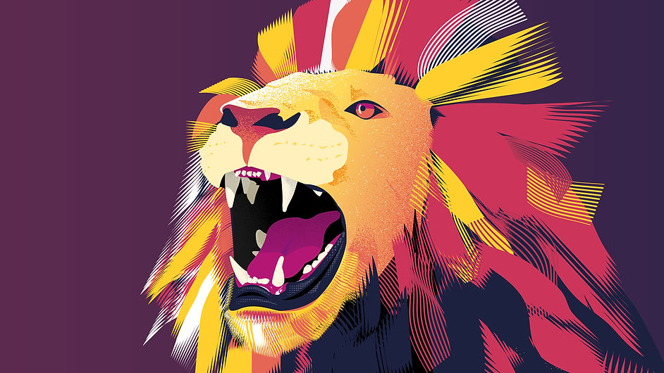
The QS World University Rankings is QS’s most well-known product garnering global press coverage with each launch of their 27 rankings throughout the year. This popularity is an extremely important touchpoint for brand-building at QS.
Pre-rebrand the audience and culture of that time was centred around being the best. In terms of brand archetypes the company was “The Ruler”, focused on the elite few. The best students for the best universities. The lion of the QS World University Rankings was therefore an extremely appropriate image for the company and had become its unofficial mascot.
As the company diversified through strategically purchasing various businesses to build its portfolio to be the go-to higher education solutions provider the culture and outlook of the company began to change, becoming more focused on nurturing and guidance. The lion mascot was no longer a good fit for what the company had become.
Identity solution

With the new outlook and culture of the company and the visibility of the QS World University Rankings meant that its campaign image must be completely in line with the reflection section of Kapferer’s Prism noted above, making the student the hero of the story.
Looking at the problem through this lens the image must develop a story that touches on; growth, advancement, progress, new experiences, preparation and effort.
This image was produced because it encapsulates all of the above either directly or indirectly through associations such as human endeavour that are strongly associated with space exploration.
This approach has enabled QS to define a story that ties its illustration style with exactly who they are as a company.
Iconography problem
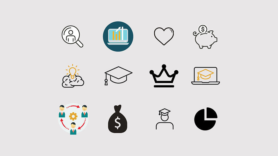
Icons had been selected from various sources with no consistent grid, or stylisation defined with which to build each icon. This ultimately led to poor cohesion and it gave a signal of inconsistency which was subtly undermining the trust that the company had worked to build.
Iconography solution

The icon style must be cohesive to present a unified front and develop trust with the company’s professionalism.
The new QS illustration style is extremely free, almost sketchbook-like in its freedom. This reflects the planning stage of our student audience. However, icons need to work in a broad variety of situations and platforms that have rigid rules to adhere to, our free-flowing illustration direction is an anthema to what we need from these icons.
To solve this tension we followed a rigid grid system with specific line weights, this simple approach ensured the proportions of each icon are harmonious, then to build a link to our illustration style we added deliberate but limited errors into the each icon, either through overshooting or adding additional strokes to simulate harder pen pressure as if they were hand drawn.
This ensured that the icons are easily interpretable yet have a built in synergy with QS' unique illustration style.
Appearance problem

Using instagram screenshots above to gauge the broad outward appearance of QS it demonstrates that there was little cohesion and a lack of direction.
The brand had became reliant on individual ability and taste rather than following a strong brand direction. Going forwards the QS brand was not able to be safeguarded with this approach and was at the mercy of popular trends.
Appearance solution
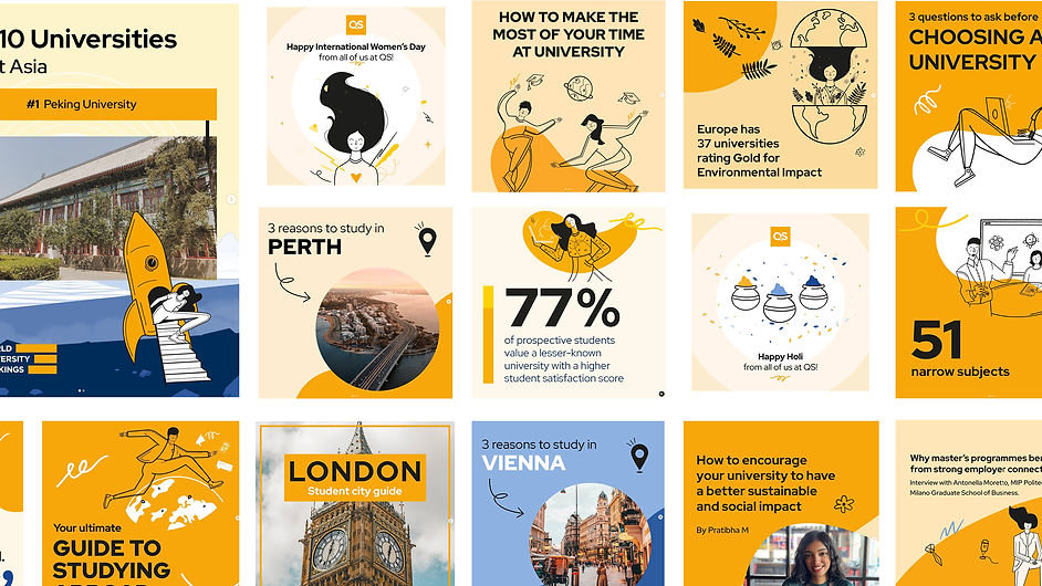
Aesthetically, our main goal was to align QS to the orange and the illustrations. We wanted to create such a strong visual brand identity that the company would be recognised without even the logo being visible. We built templates that ensured these aims could be achieved consistently, allowing the creative team to focus on the concept rather than the branding.
The biggest adjustment was in fact the content strategy for the QS social media channels. There had been a general push pre-rebrand for more aspirtional photography. Post rebrand, and in-keeping with the “guide” archetype we increased the amount of text within our assets to provide information and advice. This is something that we had discovered that our audience came to us specifically for.
Our social channels were now a flag ship for the brand and something for the rest of the business to work towards.
Brochures / guides problem

Overall, there was a lack of consistent direction, because there was no central place where this content was written. In order to counter that, templates had been built to reduce the reliance on the individual skill of the designer but these had been based on the fundamentals that had become out of touch with the modern landscape and the new culture of the company.
These assets, whilst supporting our clients and students alike were not building on the brand recall of the company.
Brochures / guides solution
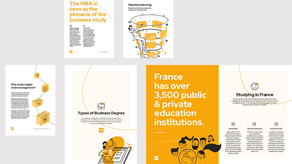
We centralised the content team and created writing style guides, this ensured that the copy-writing became consistent, it also formed good working relationships with the design team allowing for a deeper understanding between the two.
On the design side we built modular templates with strong utilisation of the orange colour as well as standardised grids and design patterns, reducing the number of decisions each designer was required to make for each task.
The improved relationships with the content teams allowed for an impressive creation of bespoke illustrative assets to signal the strength, professionalism and seriousness of the company.
The QS brand appearance is now completely cohesive, fun and iconic.
Results
The rebrand achieved a 29,000 increase in social media followers within 9 months following the launch. More specifically the numbers of traffic driven via QS's social media channels to their websites post rebrand were really impressive, seeing a jump in "new visitor sessions" from 645 to 6,993, the views on social media also rose significantly from 1,458 to 30,848.
It has been sustained, QS's recent World University Rankings Asia campaign that was more encompassing of the QS story achieved a 1,278% increase in LinkedIn engagements and 277% increase in web visits via LinkedIn.
Useful links
QS online brand manual:
QS social channels:
www.facebook.com/topuniversities
Websites:
Footnotes
*Whilst the visual brand identity can signal some aspects of this, for example “Guide” would mean the use of a clearly legible font because a guide simplifies complexity, a font that is difficult to read would only add to the complexity. The “Relationships” only represents a small part of the issues of this case study.